
Choosing Web Fonts That Work Across Four Scripts
Learn how to evaluate typeface coverage for English, Chinese, Malay, and Tamil. We’ll break down glyph sets and rendering consistency across browsers.
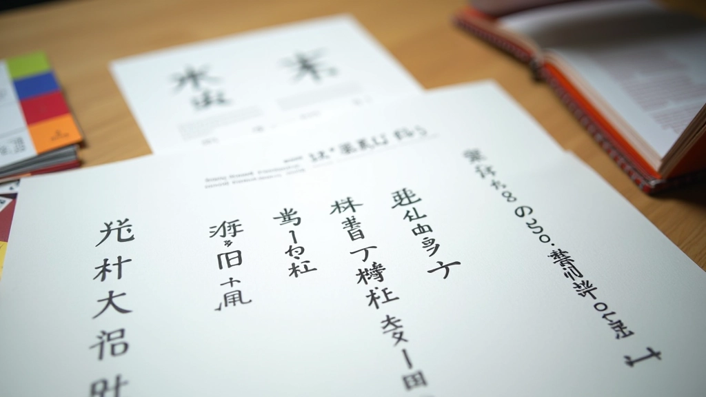
Read GuideMaster multilingual font pairing for Singapore’s diverse digital landscape. English, Chinese, Malay, and Tamil rendered beautifully together.


Typography isn’t just how text looks — it’s how people from different cultures experience your message. When you get the fonts right, everything feels intentional.Learn Our Story
Singapore’s four official languages create a unique design challenge. English needs different spacing than Chinese characters. Tamil conjuncts require their own rhythm. Malay sits somewhere between. We’ve spent years figuring out how to make all four work together without compromise.
It’s not about picking the best font for each language separately. It’s about finding typefaces that genuinely cooperate, that share similar metrics and optical weight, that let you build a single coherent design system instead of four separate ones.
Building multilingual typography requires solving four distinct problems at once
Not all typefaces include complete glyph sets for Chinese, Malay, and Tamil. Finding families that cover all four languages without looking patched together takes real work.
Chinese characters are roughly square and need more breathing room. Tamil has complex conjuncts. Latin text is compact. A single line-height value won’t work — you need strategic CSS that respects each script’s needs.
Multilingual fonts are large files. Variable fonts and subsetting strategies are essential. Singapore’s fast connections don’t excuse slow loading — users notice everything.
A heading size that works for English might overwhelm Chinese text. Establishing consistent visual hierarchy across four languages requires careful typography planning and CSS finesse.
How we learned to solve multilingual typography challenges
Started working with Singapore clients frustrated by mismatched fonts across languages. Realized there wasn’t good guidance on this specific challenge. English-only typography best practices don’t apply when you’re juggling four scripts.
Tested hundreds of font combinations. Analyzed rendering across browsers and devices. Discovered which typeface families had consistent optical weight across scripts. Mapped out line-height values that actually work for all four languages together.
Developed a complete framework for multilingual typography. Created tools for testing font pairing. Built performance benchmarks for web font loading. Started documenting everything we’d learned.
Publishing detailed guides on font selection, CSS techniques, and performance optimization. Working with designers across Southeast Asia who face the same challenges. Building the resource we wished existed when we started.
The scale of multilingual typography challenges
Font families tested for multilingual compatibility
CSS techniques documented for line-height management
Pages reviewed for typography consistency
Official languages covered in every guide
In-depth guides on multilingual font pairing for Singaporean websites
Learn how to evaluate typeface coverage for English, Chinese, Malay, and Tamil. We’ll break down glyph sets and rendering consistency across browsers.
Read Guide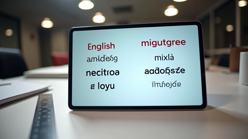
Chinese characters need more breathing room than Latin text. Tamil conjuncts require different spacing altogether. Here’s how to set up CSS that handles all four gracefully.
Read Guide
Fast connections don’t excuse slow font loading. Variable fonts and subsetting strategies keep your multilingual pages responsive, even with complex character sets.
Read GuideWhat designers ask about multilingual typography
Sometimes, but not always well. You’re looking for typeface families that have complete glyph coverage and maintain consistent optical weight across scripts. It’s possible — but requires careful selection. That’s why we’ve tested so many combinations.
It’s massive. Chinese characters are roughly square and need more vertical space than Latin text. If your line-height is optimized for English, Chinese will feel cramped. You’ll want to use CSS that adjusts spacing based on the language being rendered.
They can be, but strategic subsetting helps enormously. Variable fonts reduce file sizes. Lazy loading and critical font declarations make a difference. Singapore’s fast networks help, but you shouldn’t rely on speed to excuse inefficiency.
You can’t just use the same heading size for English and Chinese. A 2rem heading works for English but drowns out Chinese text. We recommend working with scale and weight to maintain hierarchy across all four languages consistently.
If you’re building something serious for a multilingual audience in Singapore, yes. These aren’t edge cases — they’re core design decisions. Our guides help you understand the principles, but working with someone who’s tested hundreds of combinations saves months of trial and error.
We don’t have a one-size-fits-all answer — it depends on your brand, audience, and specific use case. But we’ve documented our top choices in the guides, with reasoning for each. The “Choosing Web Fonts” guide goes into detail about our most reliable pairings.
We’ve done the research. We’ve tested the fonts. We’ve solved the CSS challenges. Let’s talk about what you’re building and how we can help make it work across all four languages.
Get in Touch